A visualisation of the rise & fall of pollution levels in London over a year, using King’s College London’s air data animated by Brondbjerg design & developement.
View on Vimeo:http://vimeo.com/mikebrondbjerg/london-air-data-visualisation
King’s College is responsible for monitoring and reporting pollution levels (amongst other things) at dozens of sites in Greater London.
London Air are already showing pollutant levels in great detail on their site as historical graphs and and a realtime heatmap shown over Google maps.


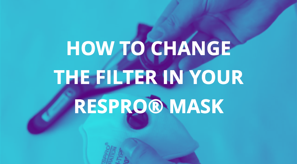


 Respro® Masks are reusable